Since the astounding success of Kanye West’s 2013 Yeezus tour, tour merchandise has become streetwear’s hottest commodity with the likes of Drake, Travis Scott, and most recently Justin Bieber following suit. With tour-related product consistently selling out at official pop-up stores across the U.S., this segment of fashion has become a fully-fledged business in its own right. And in the same way that the Yeezus wordmark appropriated the band logo of iconic heavy metal band Metallica, so have its imitators reached back into the distinct typography of heavy metal culture to add an element of false nostalgia and historical gravitas to their respective franchises. In doing so, however, the aesthetic of heavy metal has duly been sequestered for the profit of streetwear accounts that have no precedent in the subculture. Read on for our list of streetwear’s most prominent examples.
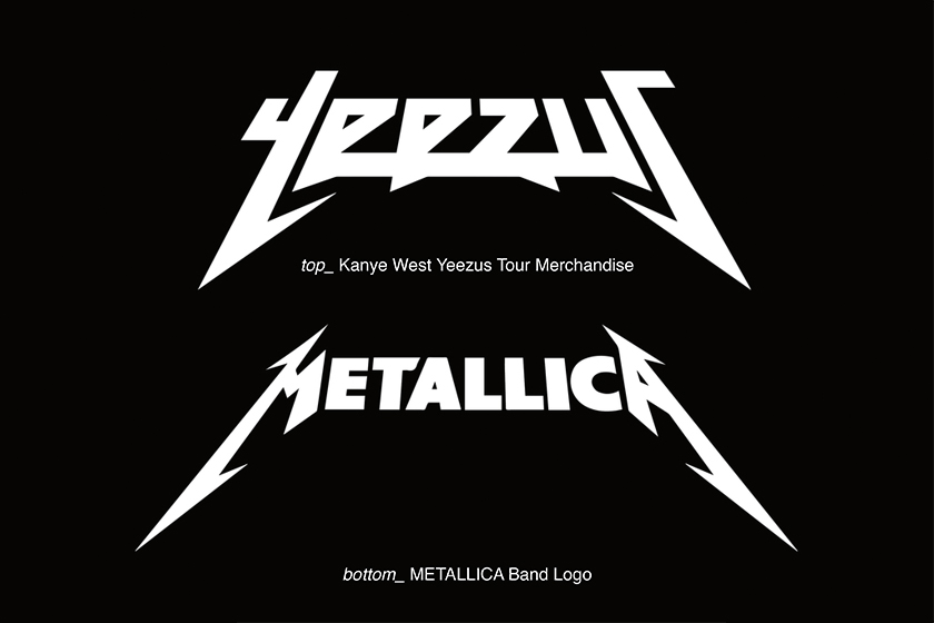
Yeezus vs. Metallica – The First Tribute to Thrash Metal
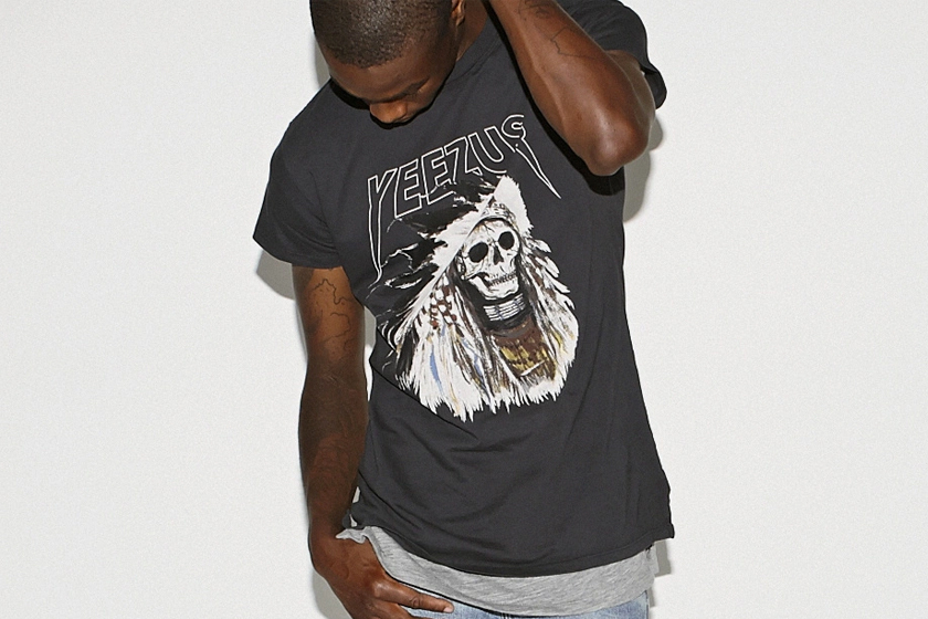
Metallica is best known for its thrash metal style — a genre of heavy metal that combines punk and hardcore influences and is defined by especially fast, repetitive drumming and guitar solos. Alongside Metallica are bands such as Megadeth, Slayer and Anthrax, whose logos often lack curves and make use of sharp points in their font design. While thrash metal is marked by its aggressive sound, it still emphasizes a large degree of control when compared to later metal styles such as black metal and death metal. Artist Wes Lang was recruited to design the merchandise and motifs for Yeezus merchandise, but it was his appropriation of the Metallica logo that received the most criticism as well as marking the beginning of the current trend of streetwear brands paying “tribute” to heavy metal music.
Balenciaga vs. Iron Maiden – A Heavy Metal Pastiche
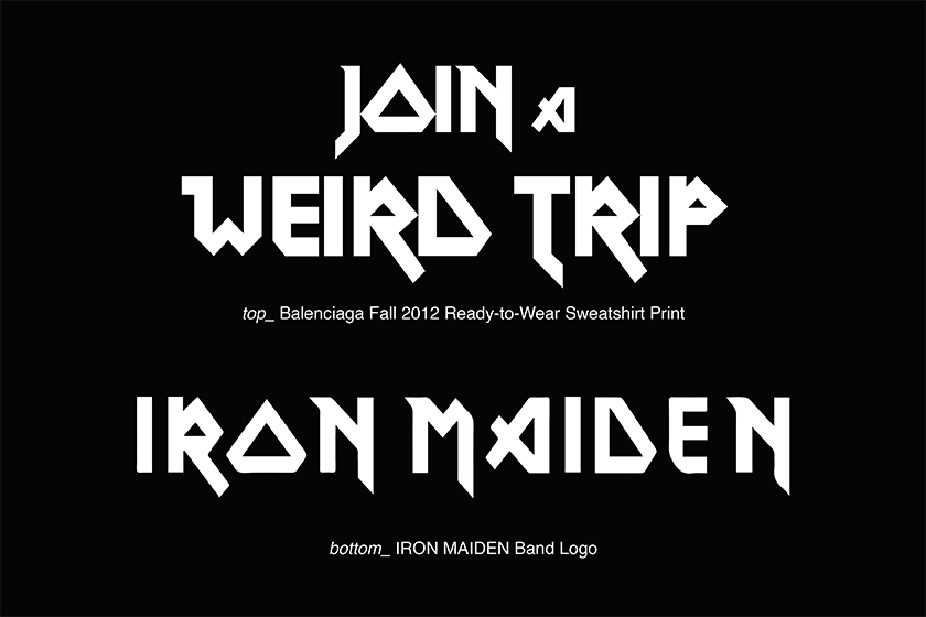
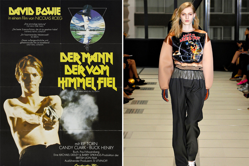
It wouldn’t exactly be fair to put the lion’s share of blame on Kanye West, as it was even earlier in 2012 that Balenciaga’s Nicolas Ghesquière used Iron Maiden’s logo as an inspiration. Iron Maiden came to light during the new wave of British heavy metal, and although frontman Steve Harris was responsible for designing the band logo, it in fact draws many elements from the font that artist Vic Fair designed for a poster for David Bowie’s 1976 film The Man Who Fell to Earth. This just goes to show that even heavy metal culture wasn’t entirely original, but the concise design speaks to its staying power to this day.
Vetements vs. Immortal – Hellish Vibes
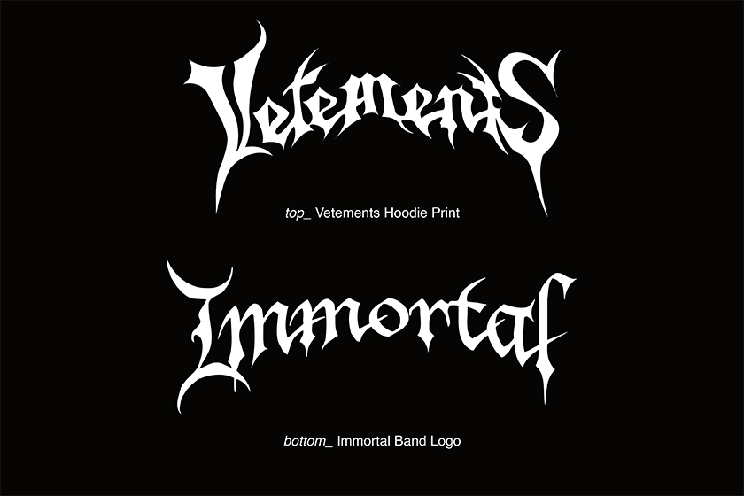
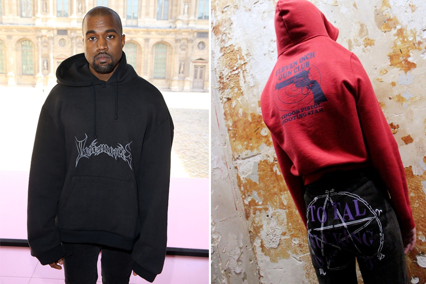
Within the logos of Vetements and Norwegian black metal band Immortal are represented many of the common graphic tropes among heavy metal bands: namely, the logos often feature capitalized first and last letters; there is a trend towards symmetry, with the two instances of T in ‘Vetements’ mirroring each other; and the logo is proportional to the band’s extremism in the sense that, the closer to the most radical genre of brutal death metal that a band is, the more illegible their logo becomes. In the same way, for Fall/Winter 2016 Demna Gvasalia of Vetements riffed off satanic symbols such as the pentacle, skulls, and blood-splashed lettering to shocking effect.
Justin Bieber’s Purpose Tour vs. Pentagram – A Lack of Restraint
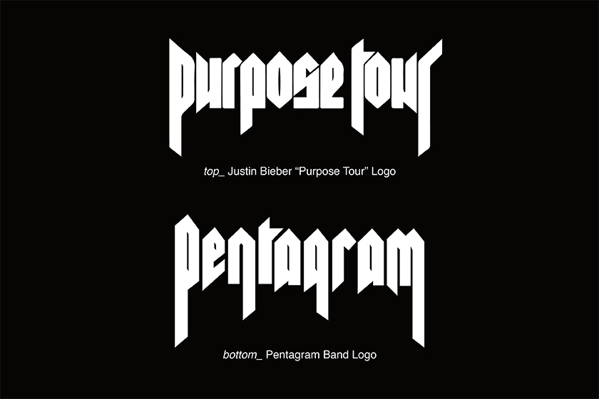
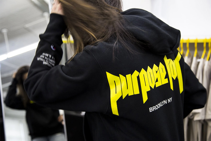
In preparing for his Purpose tour, Justin Bieber invited Fear of God’s Jerry Lorenzo to design a range of branded memorabilia. During this process, the duo re-contextualized concert tee designs from the likes of Marilyn Manson, Kurt Cobain and Axl Rose, while for the logo they settled on a pastiche of that of American heavy metal band Pentagram. Netizens had mixed reactions to the range, with many unable to accept the half-hearted designs which they saw as tantamount to completely plagiarizing the look of several iconic names in music. Branded as unfit to represent the legacies of grunge and heavy metal, Bieber might just have pushed the boundary too far this time, spurring calls from across the web that it was high time to stop with the “tributes” to heavy metal.
After Heavy Metal, What’s Next for Kanye West?
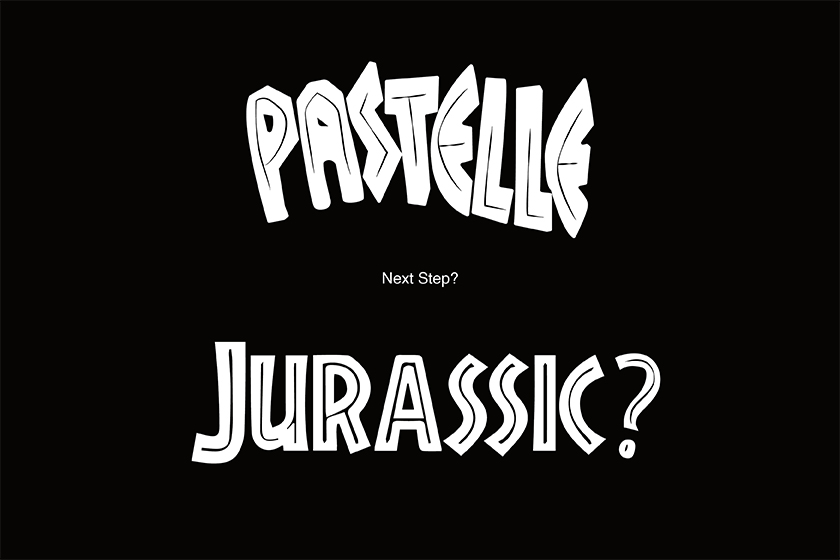
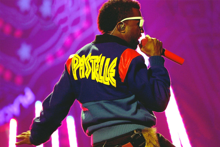
There’s no doubt that Kanye West’s style has become a proven formula for success. In his stead, the streetwear world has more often than not followed suit. However, in the wake of Yeezus, heavy metal has suffered from the widespread exploitation of its aesthetic while the vibrancy of its various subcultures has been overwritten by the stranglehold of streetwear. This trend of appropriation has had the twofold effect of attracting resentment towards streetwear both within and without streetwear circles; and contrary to the boundless information available at our hands in this digital age, has also severely narrowed the vision and restricted the creativity of the fashion world. We’ve seen Kanye have a similar effect with his Yeezy line, and with Ian Connor’s impending re-release of Kanye’s Pastelle label from 2008, we’ll only have to wait and see whether its brightly-colored palette and Jurassic Park-inspired logo will move the world of streetwear in a new direction altogether.