
Gosha Rubchinskiy’s graphic pieces are instant sellouts all over the globe, but to everyone outside the Russian-speaking world, the messages behind them are unknown. That’s probably part of the designer’s allure – the cyrillic lettering used throughout Gosha’s imagery is familiar and at the same time completely alien. It’s hard to imagine it being so attractive to Western viewers if it was in the regular old Latin alphabet.
Rubchinskiy’s work – both in clothing and in photography – is concerned with two subjects: Russia and youth. His graphics reference myriad parts of his country’s culture and history, while he enlists an ever-expanding gang of young associates, many of whom he finds through Instagram, to star in his shows, lookbooks and photography. Gosha’s work is reflecting the mindset of young people in the age of social media and instant communication, and at the same time championing a new vision of Russia – one that’s young, exciting and beautiful.
If you look in the right places (and use Google Translate a lot), you’ll find many references to youth culture, the internet and of course, Russia, scattered throughout Gosha Rubchinskiy’s collections. I hit up some Russian friends of mine, trawled Wikipedia, dug up past press releases and read through old interviews to decipher the meanings and messages behind some of the designer’s best graphic pieces. Here they are.
Fall/Winter 2012
РАССВЕТ НЕ ЗА ГОРАМИ – Dawn Is Not Far Off
For his FW12 collection, Gosha riffed on Thrasher magazine’s legendary logo, replacing the skate mag’s name with “РАССВЕТ НЕ ЗА ГОРАМИ,” meaning “dawn is not far away.” Paccbet, pronounced “rassvet” (not “pakbet”), means sunrise but is regularly used in Russia as a metaphor for better days – a fittingly optimistic slogan for the designer who places so much faith in the potential of youth.
The message regularly appears throughout Gosha’s collections, on everything from tees to a forthcoming Reebok collaboration. The OG Paccbet tees were reissued as part of Gosha’s “Greatest Hits” collection for Dover Street Market.

ВИКИНГ ’91 АРХАНГЕЛЬСК – Viking ’91 Arkhangelsk
Arkhangelsk (АРХАНГЕЛЬСК) is a port city in northern Russia that relies on icebreaker ships to maintain its access to the rest of the world. Viking (ВИКИНГ) is the name of one of the city’s icebreakers, which has been spelled out in the same font as the one used by legendary church-burning black metal act Burzum, whose first demo was in 1991 (and whose founder was imprisoned for 21 years for murdering his label-mate).
’91 was also the year of the Soviet Union’s breakup, and the dawn of the new Russia that Gosha proudly champions in both his clothing and photography.
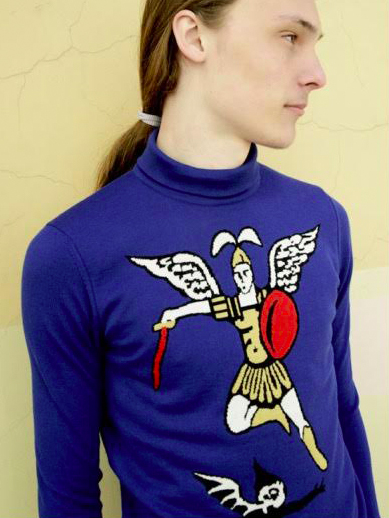
ГЕОРГИЙ ПОБЕДОНОСЕЦ – St. George the Conqueror
Another piece inspired by Arkhangelsk. Woven into this intarsia-knit sweater is a depiction of Archangel Michael, the devil-slaying angel who appears on the city’s coat of arms. The sweater was also resurrected in 2015’s “Greatest Hits” drop.
Spring/Summer 2014
БУДЬ ГОТОВ ВСЕГДА ГОТОВ – Be Prepared, Always Prepared
Rubchinskiy’s SS14 collection featured this long-sleeve adorned with “БУДЬ ГОТОВ ВСЕГДА ГОТОВ” (“be prepared, always prepared”), motto of the Vladimir Lenin All-Union Pioneer Organization, which was sort of like the USSR’s version of the boy scouts.
The phrase was regularly used in Soviet propaganda pieces and in Gosha’s SS14 collection it appeared alongside a dawn symbol and some warped, post-internet graphics. The mixing of traditional Russian messages with modern youth culture is a recurring motif in Gosha’s work, as you’ll see later. The piece was also reissued in the “Greatest Hits” collection.
Fall/Winter 2014

ЭПИЧЕСКИЕ ТУЗЫ – Epic Aces
For FW14, Gosha enlisted the help of Moscow’s Epic Aces skate crew, who sampled Jason Dill’s Fucking Awesome logo across a selection of sweaters, tees and beanies, and replaced the words “Fucking Awesome” with “Epic Aces.”
Spring/Summer 2015
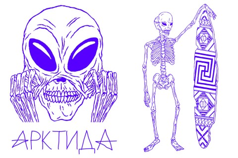
АРКТИДА – Arctida
For his SS15 collection, Gosha took a conceptual trip to Arctica (or Arctida, as it’s known to Russian geologists), an ancient continent that now forms parts of Canada and Siberia. Due to its remote location, the region enjoys endless light during summer, and was used by Gosha as a symbol for his optimistic messages of dawn and hope.
The cartoon-ish graphics running through the collection’s intarsia-knit sweaters, hoodies and tees were based on old Russian myths of aliens landing in Siberia, while the crudely-drawn sunrise motifs on the collection’s baseball caps (which also appeared in his collaboration with Timur Novikov) were inspired by the Pomors, an ethnic minority from the north of Russia.
Fall/Winter 2015

СПОРТ – Sport
Gosha’s Fall/Winter 2015 collection – which was unveiled in a Parisian church – featured garments adorned with “sport” in both cyrillic and Chinese alphabets, as well as some much-hyped pieces that placed Russian and Chinese flags side-by-side in a pastiche of Tommy Hilfiger’s iconic logo.
The clashing of Russian and Chinese flags combined with the “sport” motif was a nod to the healthy competition that both countries enjoyed in the heights of communism – ultimately, a message of peace and cooperation.
“This is a peaceful message. That’s why the boys walked under the Chi-Rho symbol for Christ,” Gosha explained of the collection when I interviewed him for issue 10 of Highsnobiety‘s print magazine. “I wanted to show how all these various influences can inhabit the mind of a teenager in the information age.”
Spring/Summer 2016
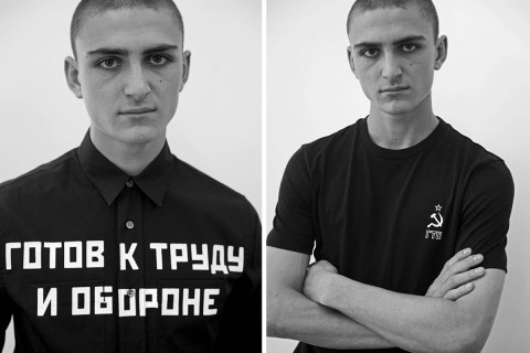
ГОТОВ К ТРУДУ И ОБОРОНЕ – Ready For Labor and Defence
ГОТОВ К ТРУДУ И ОБОРОНЕ, often abbreviated to just “ГТО,” was the Ready for Labor and Defence program, an initiative designed to involve citizens of the Soviet Union in sports and exercise. The print appeared on SS16’s shirting and tees, while the collection as a whole was dominated by sportswear themes – most notably with track jackets, striped vests and athletic shorts.
Fall/Winter 2016

СПАСИ И СОХРАНИ – Save and Protect
For his latest collection, Gosha looked back at Russia’s nascent punk and skinhead scene, and juxtaposed its imposing, uncompromising looks against the message “СПАСИ И СОХРАНИ” – meaning “save and protect.” It’s a common prayer used by followers of the Russian orthodox church, and is regularly engraved onto crosses, to ward off evil and as a symbol of faith.
FW16’s contrast of punk style with traditional Christian messages is, I imagine, another metaphor for the way seemingly opposed ideas can coexist in the minds of internet-savvy youths.
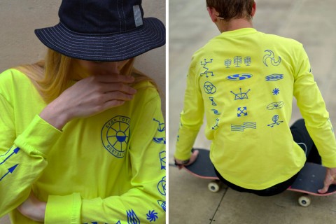
For more from Gosha Rubchinskiy, check out the new editorial he shot for Supreme and GRIND magazine.